INK MASTER
Editorial Director / Writer
While some of my friends began collecting tattoos in high school, much to my mother's relief, I've remained one of the last ink-free millennials. That said, I’m suprisingly well-versed in color theory, shading, and line work thanks to a decade of developing creative campaigns for Ink Master.
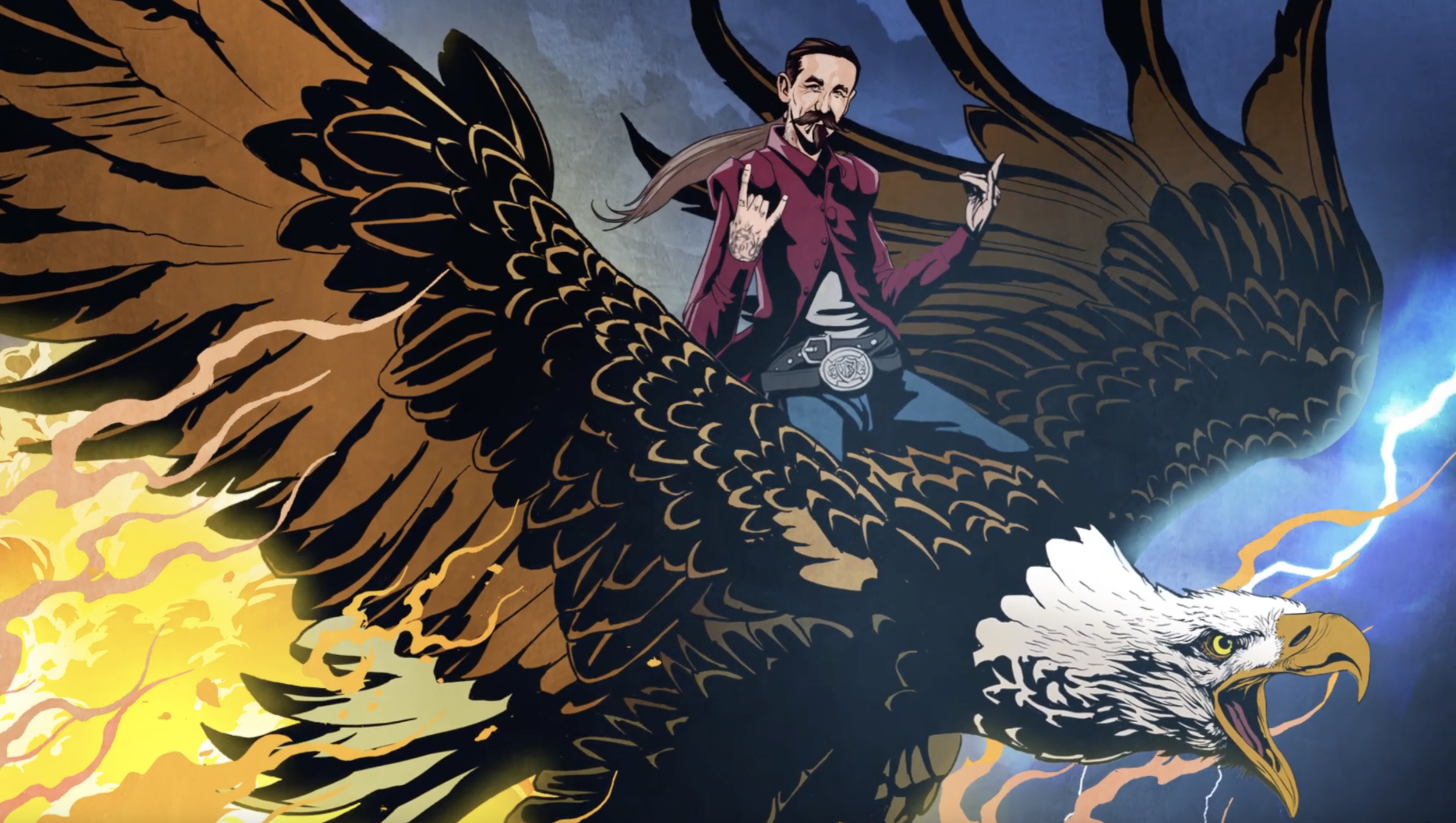
The Ink Master: Return of the Masters campaign (first below) is still my favorite. When the data revealed that fans were tuning in for the incredible tattoo artistry – and not the typical reality-show drama – we shifted the spotlight to the art itself and created a fully animated launch campaign that sent our artists on a mythical journey, all inspired by iconic tattoo styles. The trailer went on to win Gold and Silver Promax Awards.
We also created a series of social spots executed in comic-book style animation that told the origin story of each iconic Ink Master judge. We then printed special edition Ink Master comic books and passed them out at tattoo conventions leading up to the premiere.
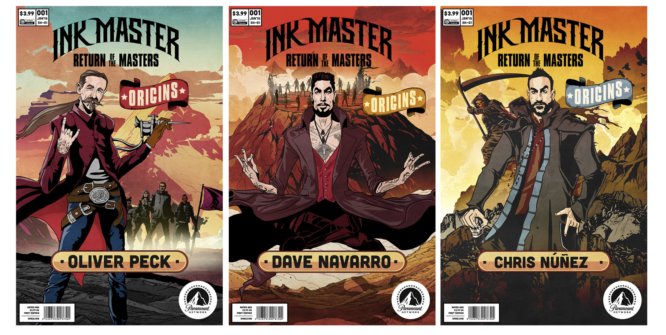
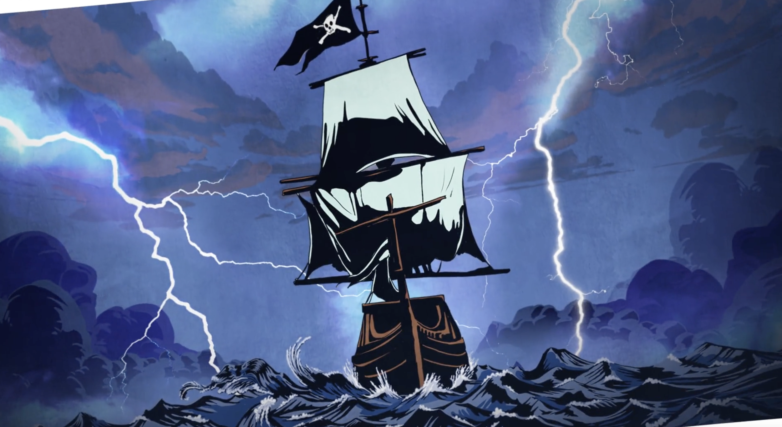
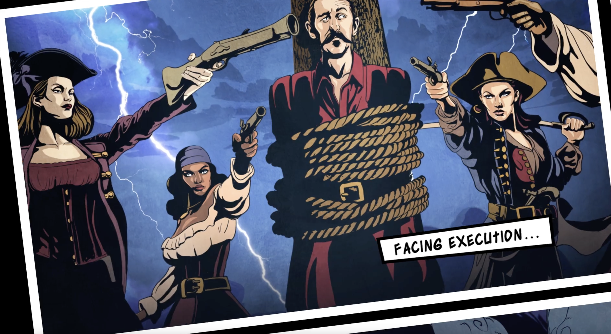
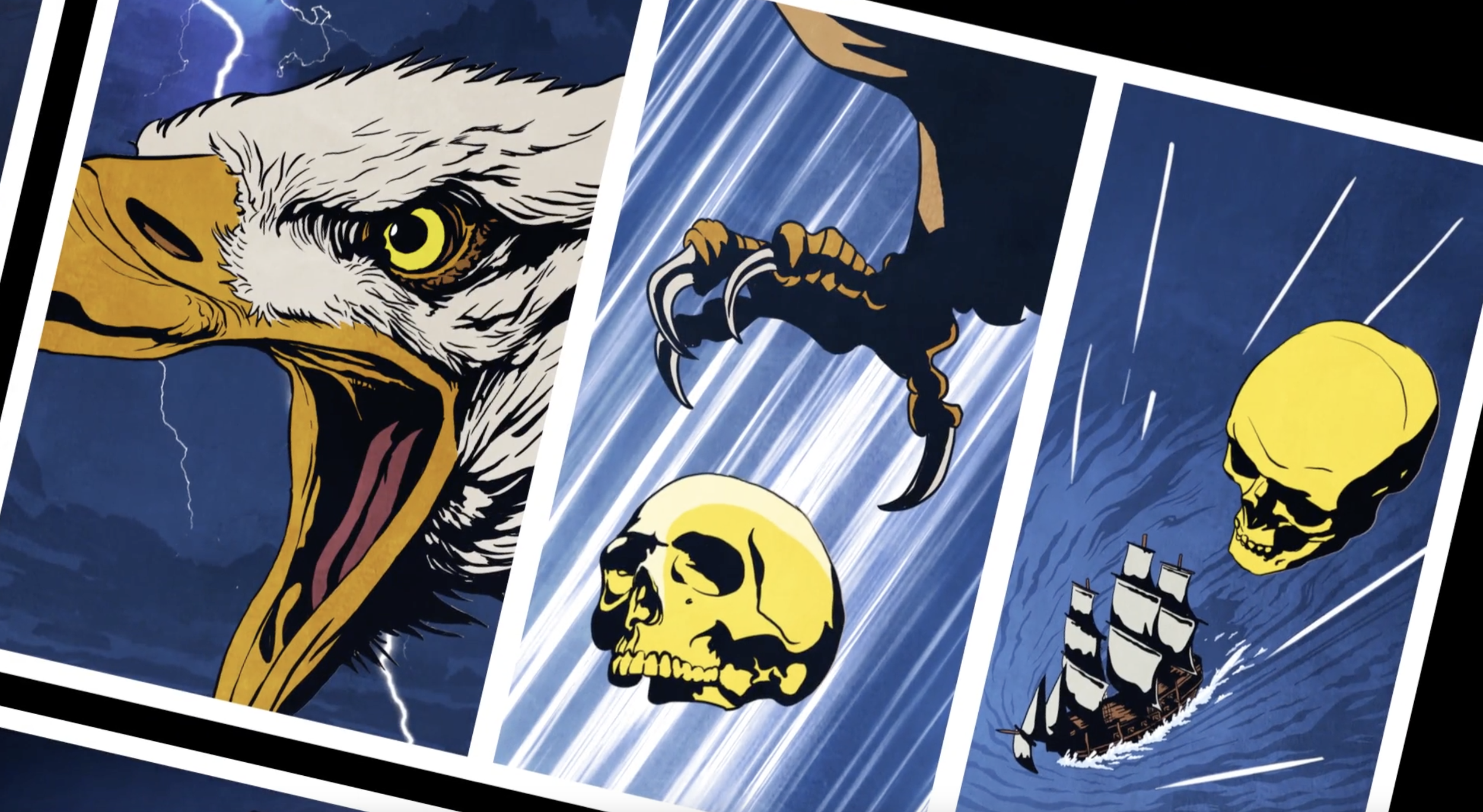
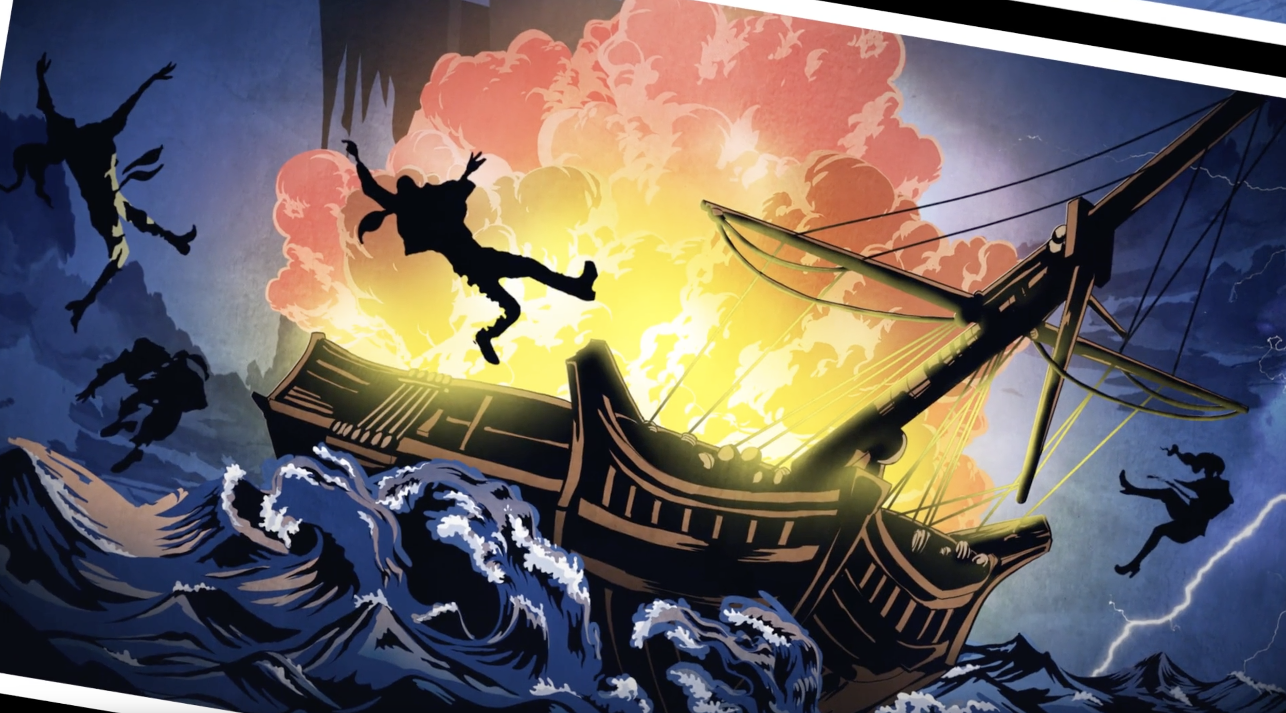
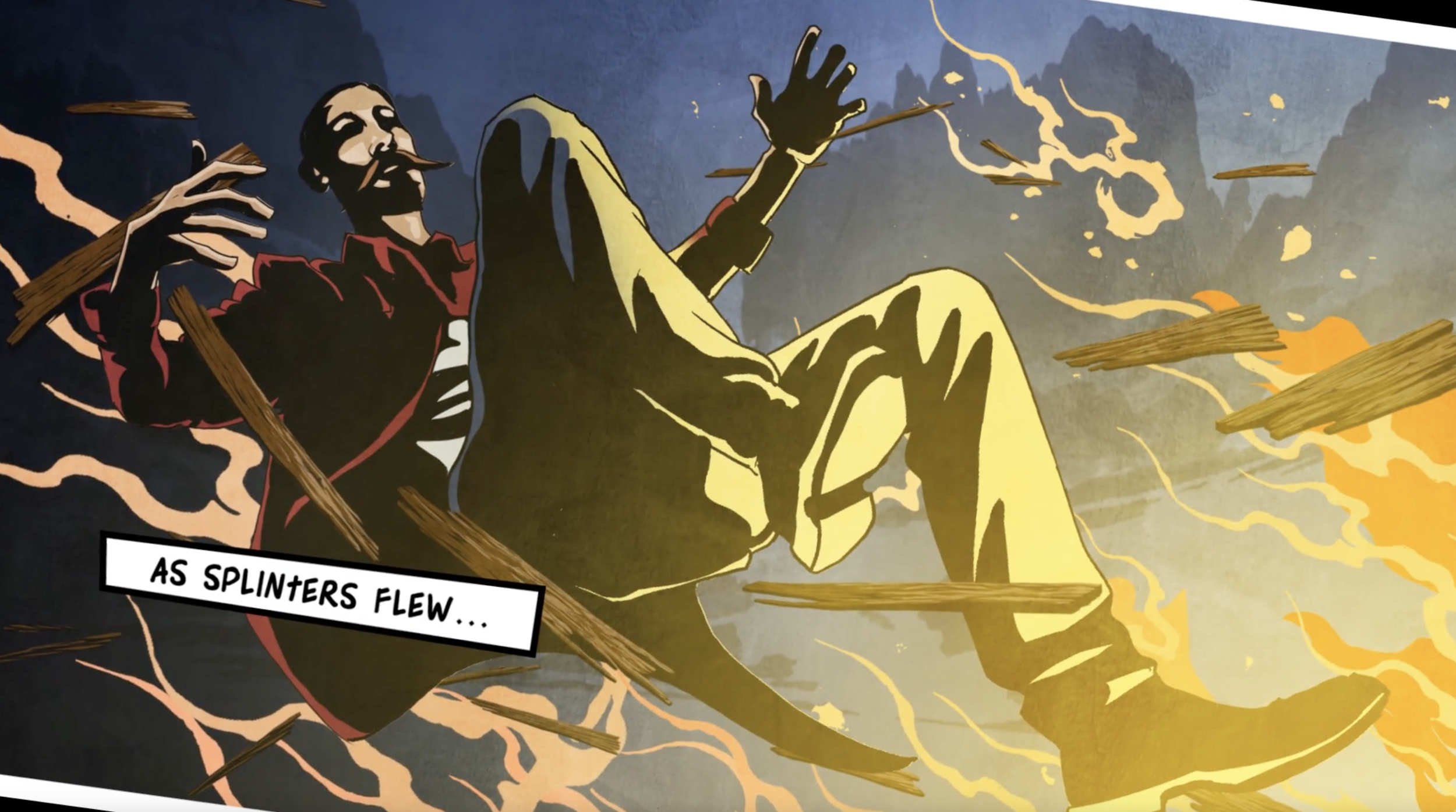
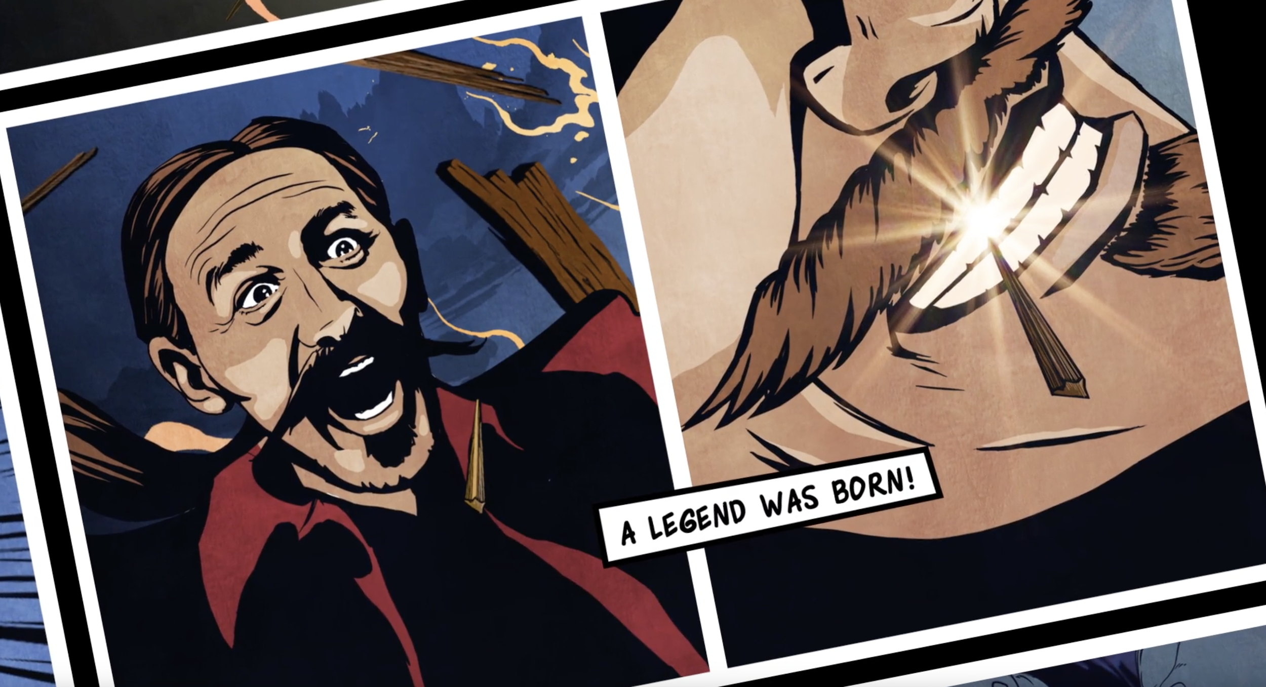
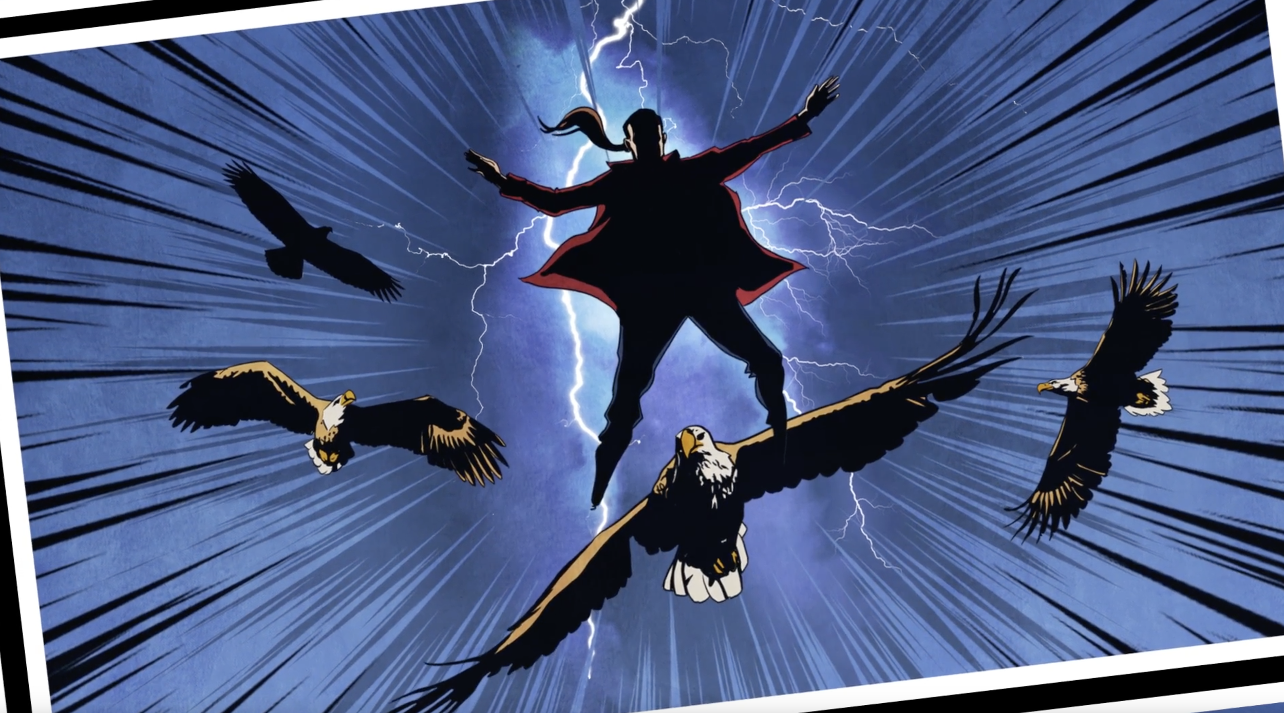
My approach to developing Ink Master campaigns almost always began with a conversation with one of my art directors. We'd start with a single striking visual, then I’d build a narrative that extended naturally from that image.
For Ink Master: Turf War, that spark came from the iconic neon signage found in tattoo shops. We imagined the artists interacting with glowing neon tubes, creating a bold, graphic visual that felt authentic to tattoo culture. From that image, we developed the campaign concept.
In the Ink Master: Peck vs. Nunez trailer we turned an old abandoned power plant in Yonkers, NY into a post-apocalyptic battle ground for a color war. It was a memorable shoot and I only glowed for about a week after production.